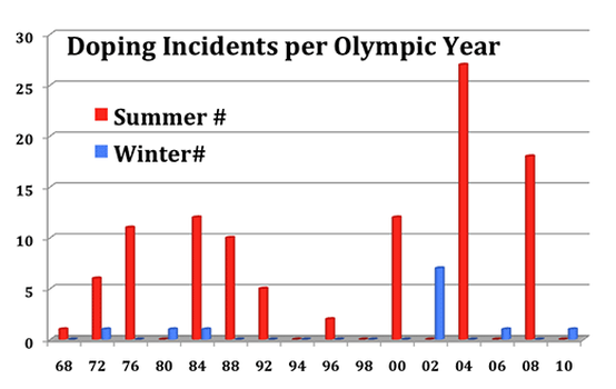
This bar graph shows clearly how doping is way higher in summer olympics, this is because the sports with the higher averages in doping take place in the summer olympics.
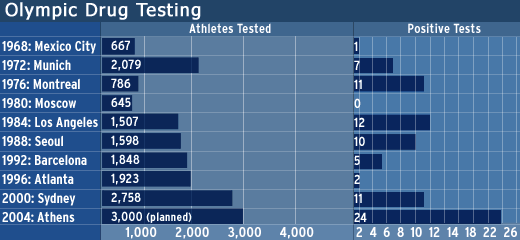
This other graph shows the corelation between the amount of ahtletes tested in each place and the amount pf them that were positive.
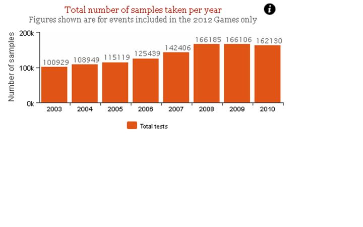
This bar graph shows the total number of samples taken per year. You can see a great increase through the years due to the development of new doping techniques. But in the bars of 2009 to 2010 you can see a small decrease. This is beacuse of the birth of the new anti-doping agencies which dedicate their time to stop doping in sports. (like WADA)
